Let’s be honest: Google isn’t known for making things really pretty. They’re a company of academics who, it is my sincere belief, hire interns to do all of their design for them. There are a few basic things that they get wrong in their Mobile Safari web search that are frankly embarrassing for them.
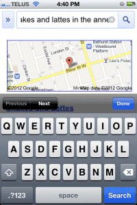
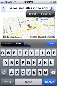
The most frustrating thing about search with Google on your iPhone is that search doesn’t really work. You’re laughing, I know, but it’s true. If you’re searching for something longer than a few words, your text is obscured by the “clear text” button in the text field.
That alone isn’t that bad. However, heaven forbid you’d like to change the text at the end of your search query because it is impossible. I’m not being hyperbolic here, it is literally impossible to do and you have to erase your entire query string and start over.
Typing does nothing. At all. This is beyond frustrating. Its a text field, Google, how on Earth can you fuck this up?
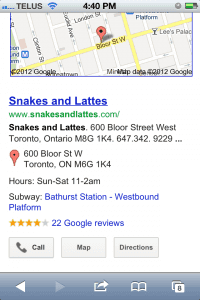
Last point. If I’m on a phone, it’s not a bad assumption that I might want to, you know, call someone. Google Search results used to display a phone icon next to the telephone number of a business in their search results. This was both useful and a nice visual design. Obviously this had to change.
Now all I see is the “call” button. Which sucks because in my basement apartment, I have to use my landline to call people because I have no cell reception (just wifi for Internet access). Fantastic. Now I can’t see the number of the business I’m calling.
The fact that search with Google in Mobile Safar is so friction-y and has been so broken for so many months tells you exactly how much Google cares about your user experience: not at all.
Please submit typo corrections on GitHub


