Ashley sent me a survey for the Canadian University Press because she knew that I’d appreciate tearing it apart on my blog. I’m looking forward to our life together. First off, we have this gem:
![]()
For journalists, I’ve always found student-run newspapers to be graced with an overabundance of spelling errors.
They want to know how you found out about the survey:
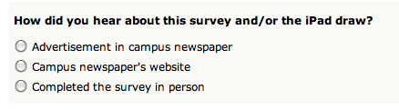
The inanity of the assumption that I found out about the survey via one of these limited options is overshadowed only by the stupidity of having a list of radio buttons which are all unchecked. When I didn’t check any one in, of course it gave me an error.
Then there was this awful table trying to get you to select on radio button per column to rate some items in order of importance:
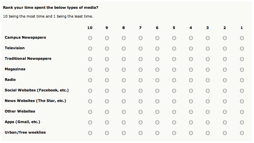
It’s a terrible way to get users to order things! It’s confusing and doesn’t behave according to any convention. A better solution would be reorderable list, a la iPhone:
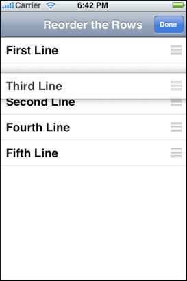
I know it would take some intense javascript action to pull this off in a browser (jQuery?), but I think the results would be worth it.
The survey bored me to tears and about the only redeeming quality I can discern is the fact that clicking anywhere in the div of a radio button would select it for you. Oh, and the iPad giveaway.