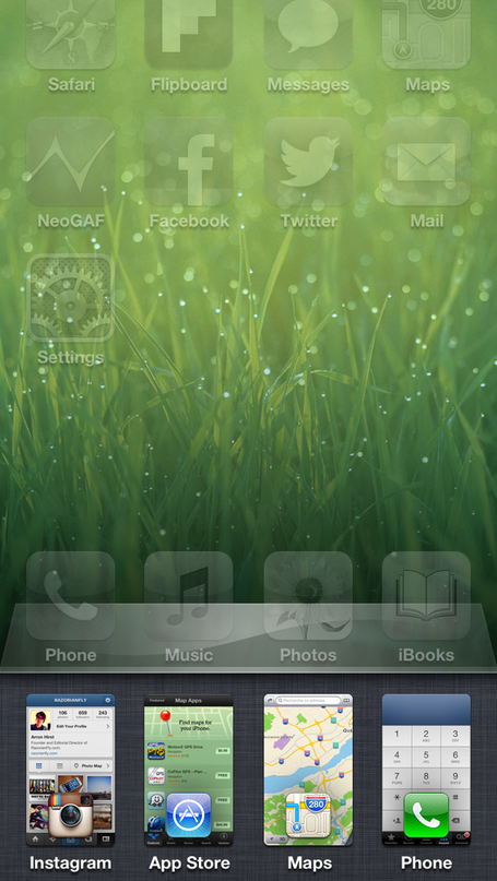
I saw this article tweeted by someone last week. The idea is that with the iPhone 5’s taller screen, we can “fix” the multitask bar.
The goal is to offer extended functionality that takes advantage of the extended screen real-estate.
Yeah, OK bud. We’ll see.
I respected the person tweeting, so I wrote it off to the fact that they must be drunk. Then I saw it again. And again. And again. Like a case of herpes, this article just keeps coming to the surface of my Twitter feed and I can’t abide by it anymore.
Instead of the app switcher bar introduced in iOS 4, they propose something that looks like this:

Hmm. So in addition to the app icon and name, they want a screenshot of what that app would look like if you opened it .
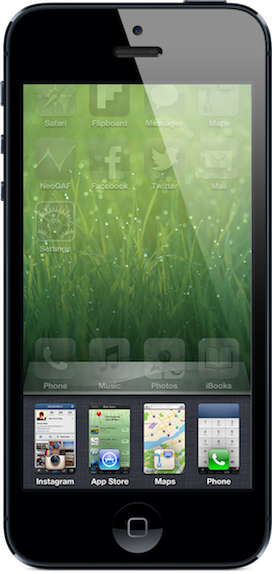
Let me put this in perspective for you.

That’s what the designer is suggesting, in relation to the device you’re holding. That when you open the app switching tray, you see miniature icons on top of miniature apps that are hard to visually distinguish. With varying heights, too, or are they going to letterbox the app screenshots in the multitasking tray?
What about apps that aren’t running? You’re going to show the last screenshot taken when the app was exited? (This is already a part of iOS.) Most apps don’t save state between app launches perfectly (or at all). The user is going to tap on a screenshot of an app to see it open to something that’s not represented by what they tapped on.
Fantastic user experience.
This design is more confusing and hard to use than the existing one.
The existing app switcher isn’t even an important part of iOS. This is evidenced by the fact that you have to double tap the home button to open it. You think most users know about that? Then you’ve been hanging out on Hacker News too long. Double anything is the practically the definition of unintuitive.
Multitasking is a great feature of iOS, and the app switcher is a great tool for power users. But if you think clouding this tool by making it behave differently on different devices, and in a really complicated way, then you’re dreaming.
I like what the designer did with the playback controls; the designer obviously has talent. But they need to learn that just because you can doesn’t mean you should.