Facebook had a decent iOS app. It wasn’t great, and you couldn’t do everything you could on the mobile site, but it worked reasonably well and it was nicely designed. They recently updated to a “better” version that lets you do everything you can on the mobile site, but it has the unfortunate distinction of completely sucking.
Facebook apparently fell victim to one of the classic blunders, which is Write Once, Run Everywhere. They got greedy and thought that they could stuff their entire app in a little UIWebView, write some fancy HTML5, and then no one would be the wiser. Well, they really fucked that up.
The transition to/from the message detail page is hilarious. As you pop from a message detail to the list, you can see the message detail grow to fill the space no longer occupied by the keyboard as it disappears. Rule of thumb: after you tap a “back” button, the view you’re moving away from shouldn’t change. It’s incredibly distracting and shows that whoever wrote that code has no idea what contentInset is (when they find out, it’s going to almost certainly blow their mind).

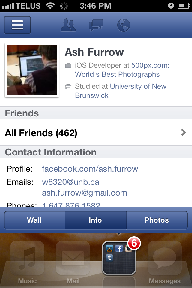
Somehow, they change their key window’s frame and you can, occasionally, actually see your homescreen behind the app. It doesn’t happen as frequently anymore, so I can’t find a screenshot, but I’ve mocked up what it looks like.
*golf clap* Well done, Facebook. I honestly don’t know how you could do that, so bravo.
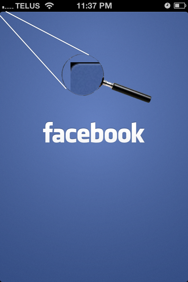
Finally, for the coup de grace, Facebook at one point decided that it wanted rounded top corners all throughout the app. It’s very chic nowadays to pretend you’re iPhone app has rounded corners, like an iPad app, and I’ve got nothing against that. However, Facebook decided in the end not to round their corners but forgot to update their default.png launch image.

When the application finishes launching, there is a distracting visible change to the non-rounded corners of the app’s nav bar.
These are only a few of the worst visual problems with the app; they’re not huge problems themselves but are indicative of a crappy user experience in general. It makes me sad that a company which pioneers a new and innovative way to display tabbed-content to the user can fuck the rest of their app up so extraordinarily.